fanguad
Junior Strategist

Posts: 210 
|
Post by fanguad on Nov 4, 2019 13:23:40 GMT
|
|
|
|
Post by Soul Samurai on Nov 5, 2019 6:24:06 GMT
I feel bad for saying this, but to my eyes it looks like he has just too much same-colour silver. I really think he would have benefitted from a couple of different shades of steel (like a darker steel for the inner fittings), and maybe some more details picked out in brass/gold. The weapon especially does not look so good in exactly the same silver all over as his body; I definitely would have used some brass and bronze to give it more visual interest. Also the blue glow on the hammer is too close to the blue paint on the armour and base (and it's so close to the blue painted kneepads that this is made even worse) - I probably would have done it in the same colour as the glow on the face, you know? Finally I think painting the bands on the hands in the same blue and brass as the hood around the head would have looked good and better maintained "visual consistency" (is that a thing?).
Sorry for being so critical, it's just that I've been really impressed by so much of your work, so this guy ends up standing out next to them as just not being of the same quality.
|
|
shmeep
Junior Strategist
Posts: 742
|
Post by shmeep on Nov 5, 2019 8:20:13 GMT
Have to agree with Soul, I think if you would paint the hammerhead + face plate and pistons/joints + boiler in different colors from the main body it would help break up the segments.
I also agree it'd look better with blue forearms.
And yes, visual consistency is the correct term. (It's also the reason why I'm so obsessed with pre-planning my armies.)
|
|
fanguad
Junior Strategist
Posts: 210
|
Post by fanguad on Nov 14, 2019 13:37:44 GMT
I decided to paint a miniature I had rather than shell out for the Morrowan Archon. Original model is a Reaper "Solar, Angel". I 3d printed an upscaled Stormcast shield without the Sigmar emblem for his shield, then painted the Morrowan symbol on it. |
|
shmeep
Junior Strategist
Posts: 742
|
Post by shmeep on Nov 14, 2019 13:52:38 GMT
Looks good. Don't agree with the skin and hair colors, reinforces the lion theme too much. Sculpting an armored human foot would've helped. Everything else works nicely.
|
|
|
|
Post by Soul Samurai on Nov 14, 2019 13:56:10 GMT
That's pretty cool, loving the blue robes.
|
|
fanguad
Junior Strategist
Posts: 210
|
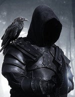
Post by fanguad on Nov 18, 2019 18:57:14 GMT
|
|
shmeep
Junior Strategist
Posts: 742
|
Post by shmeep on Nov 18, 2019 21:51:58 GMT
Very good color choices, this guy looks great. What'd you use for the fur and the leather on the coat?
|
|
fanguad
Junior Strategist
Posts: 210
|
Post by fanguad on Nov 19, 2019 13:05:23 GMT
The fur was zenithal primed, then given a wash of thinned-down Agrax Earthshade. The interior of the coat was MSP Red Shadow highlighted up to P3 Sanguine Base
|
|
|
|
Post by Soul Samurai on Nov 19, 2019 14:48:00 GMT
Very nice, the blue glow looks great!
|
|
fanguad
Junior Strategist
Posts: 210
|
Post by fanguad on Nov 26, 2019 13:14:22 GMT
|
|
|
|
Post by Soul Samurai on Nov 26, 2019 14:30:58 GMT
That purple/green cloth is interesting, but looks a bit strange in the photos. Did you paint the cloth in those colours or is that an iridescent paint? I like the colourscheme on the Satyxis, fantastic shading and highlighting as usual!
|
|
fanguad
Junior Strategist
Posts: 210
|
Post by fanguad on Nov 26, 2019 17:43:21 GMT
Gaspy's robe is definitely interesting. I knew I wanted to paint his robot parts with the Purple/Green colorshift metallic I used on the Cryx 'jacks. I wasn't sure what to paint his robes, so I looked at the studio scheme and saw his robe was green and purple. Given the colorshift paint I used, it seemed appropriate to paint his robes in the same colors - plus it's fun to not just shade and highlight with the same color. I didn't use iridescent paints, I just use a different color for the shadows. The studio's purple is a lot more subtle than mine, though. Studio Scheme here |
|
|
|
Post by Soul Samurai on Nov 27, 2019 11:00:09 GMT
The problem is that it doesn't exactly read as highlights and shadows, it just kind of looks like stripes; perhaps if the green was a bit lighter and/or the purple was darker?
|
|
shmeep
Junior Strategist
Posts: 742
|
Post by shmeep on Nov 27, 2019 11:03:53 GMT
The problem is that it doesn't exactly read as highlights and shadows, it just kind of looks like stripes; perhaps if the green was a bit lighter and/or the purple was darker? Afraid I have to agree on that one. The values seem to either be the same across the board, and in some point the purples are even brighter than the green. Making the greens a bit brighter and/or the purples darker would help with that. I don't know if the colorshift metal color would still show through, though. |
|